Application
Our application mainly consists of four different regions: The projection view, the comparison view, the attribute table and the tabular view.
Projection view
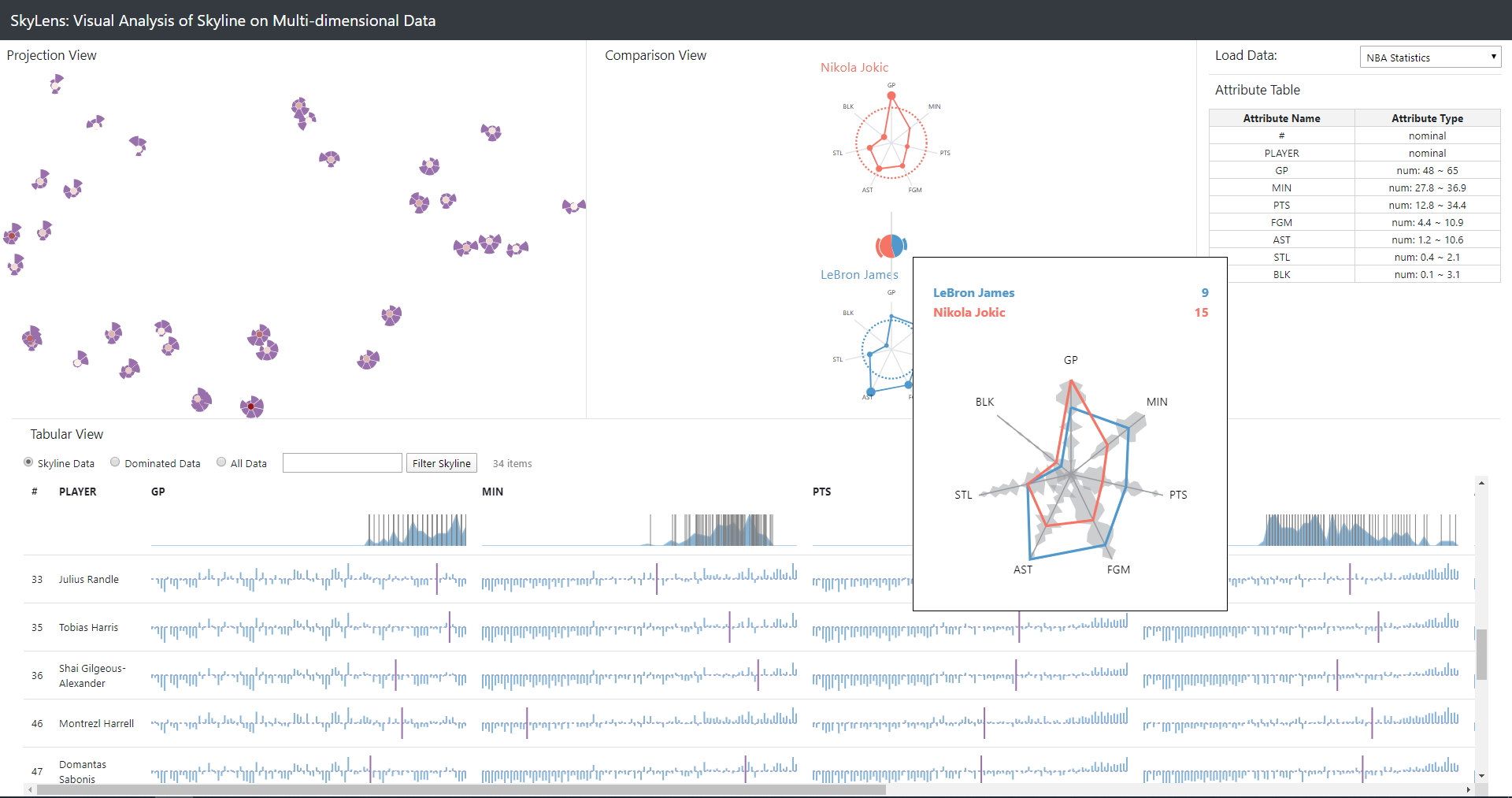
The projection view is an embedding of multi-dimensional data into a 2D plane using the t-distributed stochastic neighbor embedding (tsne) method. Tsne is no dimensionality reduction method like PCA for example, however it allows the users to quickly identify certain patterns (e.g. clusters) in the skyline of the data.
Each skyline point is respresented by a skyline glyph. The center of the skyline glyph encodes the domination score of the skyline point, i.e. how many other points in the dataset it dominates (red = high domination score, white = low domination score). The outer circle segments represent the attribute values of the skyline points, whereas the radius of the circle corresponds to the value of the attribute (larger value => larger radius).
Comparison view
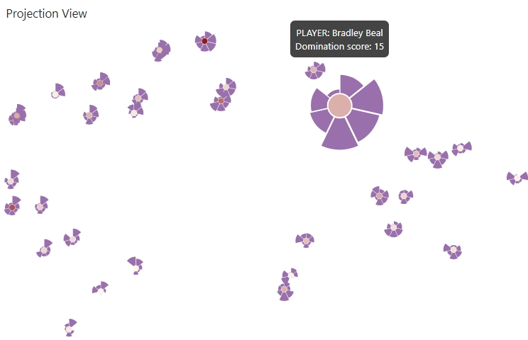
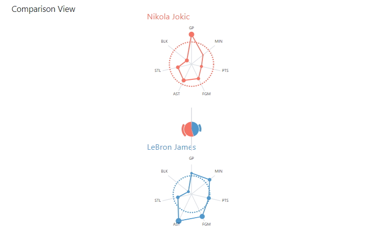
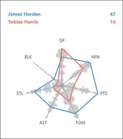
The comparison view allows the user to closely compare up to four selected skyline points. Each selected skyline point is represented by a glyph. The domination score of a point is represented by the radius of the dashed circle. Radial lines from the center of the glyphs represent each attribute and a line that goes once around the whole glyph represents the attribute values of the skyline point (where it meets the radial attribute lines). Additionally, each attribute value is encoded with a circle, which's radius corresponds to the relative ranking of this point's attribute values compared to all other point's attribute values. When hovering over a glyph in the comparison view, the glyph is drawn enlarged in an overlay view, in which additionally distribution of all attributes is encoded.
Additionally, the comparison view contains domination glyphs between the skyline point glyphs that encode the relation between the domination scores of the connected skyline points. The inner pie chart shows a comparison between the domination scores of the connected skyline points and the outer pie chart shows, how many of the dominated points are exclusively dominated by the corresponding skyline point. By hovering over a domination glyph, the overlay shows a comparison between the attribute values of the skyline points connected to the domination glyph.
Attribute table
The attribute view shows a summary of all attributes of the loaded data. This summary contains the name of the attributes as well as their type and - in case of numeric data - the range of the attribute values. Since our application only works with numeric data, the nominal data columns are not considered for any calculations and are mostly listed for completeness.

Tabular view
The tabular view lists dataset points and gives users a detailed view about individual points, as well as how good they are compared to others. By default it only shows skyline points, but this can be switched with the selection on top of the table. The case-insensitive search box to the right, lets users highlight certain points according to a search criteria. Typing in i.e. 'james' highlights all rows that contain the name 'james' in red and the table scrolls the first matched result into view. Partial names like 'mes' are also possible to find the player. The table also supports advanced filtering such as greater ('>'), smaller('<') and equals ('=') to search for specific attributes. Searching for i.e. 'gp > 20' finds all points where the value of the attribute 'GP' is greater than 20.
The header of the table displays the value distribution per attribute with vertical lines showing were each point of the dataset lies in an attribute. The respective vertical line is highlighted in red when the user is hovering over a row in the table. This helps users to quickly identify were a certain point's place in the entire dataset is. The body of the table shows the actual points as rows, with their attributes as column. Each table cell shows a diverging bar chart, where the number of bars is equal to the number of points in the entire dataset. Therefore each bar corresponds to a point in the dataset. The bars are sorted ascending according to there values dimension. A purple bar highlights the position of a certain point's attribute in a row to give the user an idea of how well a points performance is. The height of the blue bars represents the summarization of a certain point's differences in all other dimensions. Bars above the dashed middle line show positive differences, while bars below show negative differences. Hovering over on any of the diverging bar charts also highlights the point in the projection view and shows it's value. Clicking on any of the charts adds the point to the comparison view, while clicking on the first or second column of a row expands the row and reveals a more detailed view of a certain point below the diverging bar chart (see player 'James Harden' in screenshot).
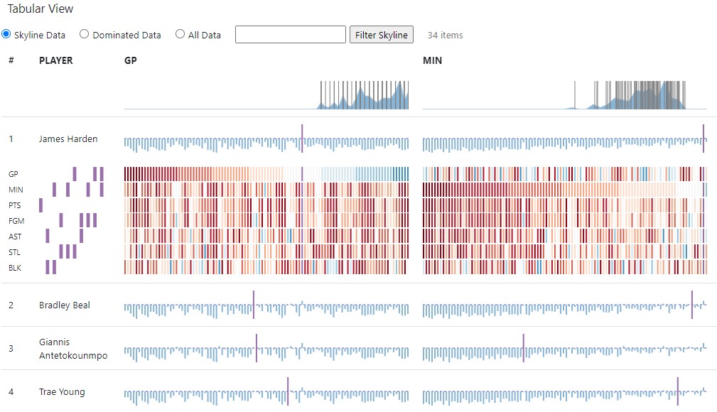
The columns in the matrix below the diverging bar chart of an attribute are aligned with the bars in the diverging bar chart. The rows of the matrix represent the attributes and have the same order as the columns in the table. The bars in each row are sorted according to the diverging bar chart above, so each bar in a matrix column corresponds to the same point. Colors are used to show the difference between a certain point and all the others, i.e. blue bars have higher values than a point marked in purple and red bars have lower values. To the left of the matrix are purple bars to indicate the decisive subspaces (smallest combination of attributes) were a point is in the skyline. Each row represents a dimension, thus if a point is in a subspace skyline, a purple bar is placed in a vertical line. The more subspace skylines a point is in, the stronger it is in different subspaces. Therefore, a point with a lot of decisive subspaces is usually preferred. The algorithm to determine the subspaces is based on the approach of Pei et al. [2].